

Working in the world of website design introduces you to a wide variety of personal style choices. From the flamboyant to the dapper, the developer with an Imelda Marcos-sized collection of shoes to the designer who saves on washing by letting his cat eat the crumbs from his hoodie, everybody has their own way of doing things and a way of presenting themselves. What they all have in common is that their style does not stop them from working and all can adapt to suit different circumstances. Even the cat has an extensive wardrobe.

If you were to walk down Oxford Street in London, you will see the same diverse range of people, albeit with more of a leaning towards the fashion conscious and sharply dressed. You would also see an awful lot of smartphones and tablets hard at work keeping these people connected to the latest trends in skinny jeans* and investment banking. And in turn Oxford Street has responded to them, earning itself the title of ‘most connected street in the UK’ with a higher proportion of WiFi hotspots than anywhere else in the country.
As the next generation of Nathan Barleys and Gordon Gekkos set about doing their thing, the one thing that they have in common is a refusal to compromise. Nobody wants to accept a reduced version of themselves, a Life Lite™. Technology, websites, internet connectivity – they all need to be on demand and in full surround sound, which is where responsive design comes in.
Because we all have smartphones with a screen resolution like a shattered wasp’s eye on LSD and fully immersive wraparound tablet balaclavas, we want the full content from a website to be displayed on them. Not selected highlights, not just the headlines – the full fat experience. In order to make this happen and in order to suit everybody’s individual style and screen size, the website itself needs to accommodate the visitor.
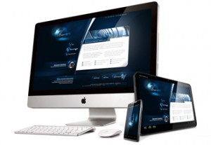
Responsive design is the latest evolution in website design to ensure you’re not missing anything when you view a site on a mobile platform. Because it is truly flexible rather than merely mobile optimized, the site looks good on any size of smartphone or tablet – even on the mythical iWatch, should it ever appear.
It also means that all of the time and effort you put in to uploading new content, search engine optimization and adding images to a gallery are going to the same place rather than having to repeat yourself for the mobile version. All of your focus can be, well, focused.
This gives you a lot more time to be out on Oxford Street or similar city locales with blistering WiFi speeds, networking and growing your business on the move and secure in the knowledge looks as good on the street as it does on a desktop.
You can find out more about and view examples of our responsive website designs on the main site.
*I’m assuming skinny jeans are still a thing, if not please replace with something suitably re-retro or whatever the new 90’s as the 60’s/00’s as the 70’s is calling itself now. Are flares back in again?
© 2026 A&M Consulting Ltd t/a Somerset Design. Registered in England and Wales. Company No. 4377058 VAT Reg. 803 6289 32 Site Info