The Y2K website design trend refers to a particular aesthetic that emerged around the turn of the millennium, particularly during the late 1990s and early 2000s. It was characterized by bold and vibrant colours, animated GIFs, flashing graphics, and an overall sense of futurism. Websites designed in this style often had a chaotic and cluttered appearance, with a focus on visual impact rather than streamlined functionality.
Neon and metallic colours, such as electric blues, pinks, and silvers, were frequently used to create a futuristic and cyberpunk atmosphere. Animated GIFs were employed liberally, with spinning logos, scrolling text, and flashing buttons being common elements.
While original Y2K designs may now be seen as outdated and excessive, the aesthetic continues to hold nostalgic appeal for some. The clutter and chaos won’t be coming back, but Y2K website design in 2023 will involve the use of loud colours, blocky fonts and 3D shapes. Think futuristic, bright and shiny things.
Asymmetric layouts in web design defy the conventional norms of grid-based structures, which rely on symmetrical and balanced arrangements of elements. Instead, they embrace a dynamic and deliberately unbalanced approach to element placement. By deviating from the norm, asymmetric layouts inject visual intrigue, foster a sense of creativity, and help websites establish a unique identity.
In these layouts, elements such as images, text blocks, and graphics are intentionally positioned in various sizes and orientations, often overlapping or intersecting. The aim is to craft visually captivating compositions that capture users' attention and guide their gaze across the page. Asymmetric layouts can be achieved through CSS positioning techniques or with the aid of design tools and frameworks, enabling designers to unleash their creativity while maintaining control over the overall structure.
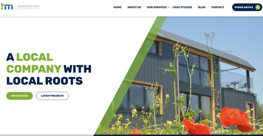
HM Construction: The recently redesigned HM Construction website (https://www.hmconstructionuk.co.uk/) displays asymmetry in several areas. Note especially the Our Services section partway down the homepage.

Neumorphism is a design style that harmoniously blends skeuomorphism and flat design, resulting in a distinct visual approach that imparts depth and a tactile quality to websites.
Delicate Shadows and Highlights: Neumorphic design relies on soft shadows and highlights to create a three-dimensional effect for screen elements. These subtle shadows are strategically placed along the edges, offering a slightly raised or embossed appearance, while highlights simulate the play of light on surfaces.
Minimalistic Contrast: Embracing a minimalistic aesthetic, neumorphic design embraces simplicity and clean layouts, often featuring ample white space. The colour palette tends to be subdued, with nuanced shades. This approach aims to establish a serene and visually pleasing interface that prioritizes clarity and user-friendliness.
Depth and Layering: Neumorphism employs shadows to craft an illusion of depth and layering, effectively separating elements from the background and each other. The gentle shadows establish a subtle visual hierarchy, enabling users to comprehend the relationships and interactions among various interface components.
Skeuomorphic Element Styling: Inspired by skeuomorphism, neumorphic design incorporates stylized elements resembling physical objects. Buttons, cards, or input fields may possess soft, rounded contours reminiscent of tangible buttons or real-world objects, enhancing familiarity and intuitiveness.
Consideration of website accessibility is paramount in web design, as it ensures an inclusive experience for diverse user groups. Users with visual or motor impairments may encounter challenges with conventional website navigation. However, voice recognition technology could act as a valuable solution, enabling individuals to interact with websites using voice commands.
A key advantage of voice recognition technology lies in its capacity for hands-free navigation. By eliminating the need for a mouse or keyboard, individuals can navigate through websites. Moreover, voice recognition facilitates improved accessibility for users with visual impairments. For instance, individuals can request specific website sections to be read aloud or have text size increased, enhancing their ability to access content effectively.
Animations and micro-interactions have become integral components of modern website design, transforming static digital experiences into dynamic and engaging journeys. Animations, ranging from subtle transitions to eye-catching motion graphics, serve to guide users' attention, create a sense of fluidity, and establish a more intuitive navigation process. These visual cues not only enhance the aesthetic appeal of a website but also contribute to a seamless user experience. Furthermore, micro-interactions, which are small, purposeful animations triggered by user actions, add a layer of interactivity that fosters user engagement and emotional connection. Whether it's a button changing colour upon hover, a menu smoothly expanding, or a playful icon responding to a click, these micro-interactions inject life into the user interface, making interactions feel responsive and enjoyable. When executed thoughtfully, animations and micro-interactions elevate website design beyond aesthetics.
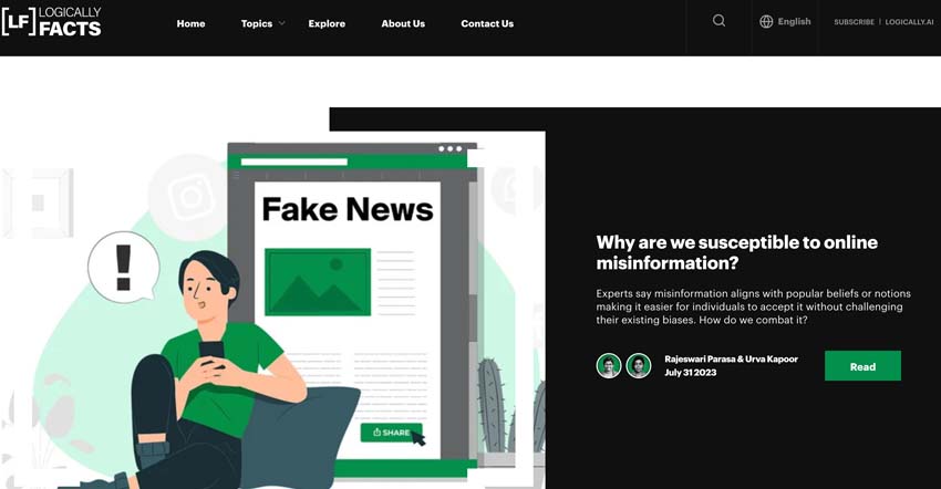
Logically Facts: (https://www.logicallyfacts.com/en/) We implemented many micro-interactions on this website. Notice the change in image colour on hover in the Explore by Topic section, the brackets that appear over images when hovered and the hover feedback on the View All buttons.

© 2026 A&M Consulting Ltd t/a Somerset Design. Registered in England and Wales. Company No. 4377058 VAT Reg. 803 6289 32 Site Info