
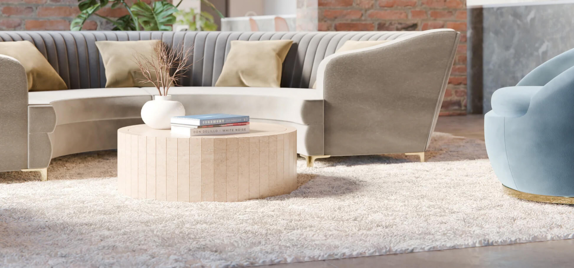

Selling furniture and interiors online is more complex than selling simpler products. A customer buying a cushion, lamp, dining table, sofa or stone console is trying to make a decision that affects how their home feels, how a room functions and, often, how a large amount of money is spent.
The website has to do more than show products neatly. It has to help someone judge scale, material, colour, quality, delivery practicalities and whether the brand feels credible enough to trust with a high-value purchase. That is where many furniture and homeware websites struggle. They either lean too far into the showroom experience and become hard to shop, or they become so ecommerce-led that the products lose their atmosphere.
Good design for this sector sits in the middle. It gives the customer enough emotional pull to want the product, then enough practical information to feel confident buying it.
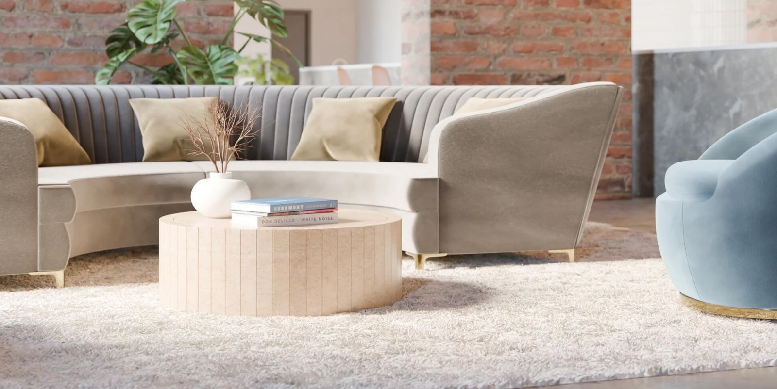
In a physical showroom, customers touch fabric, lean on a table, open drawers, sit on a sofa and walk around a piece to understand it. Online, the product page has to carry that burden. A beautiful hero image helps, but it cannot do the job alone.
The best product pages for furniture and interiors brands tend to combine several types of information. They show the product in a room, then on its own. They include close-ups of fabric, grain, stitching, stone, handles, legs, joints and edges. They explain the dimensions clearly and make the delivery details easy to find. They also give the customer a reason to believe the product will still feel right when it arrives.
This is where copy matters more than many brands realise. "Oak dining table" is accurate, but it tells the customer very little. Is the finish smooth, rustic, waxed, matt, pale, warm, heavily grained or refined? Does the table suit everyday family use, a formal dining room or a more relaxed kitchen space? Furniture copy should reduce uncertainty, rather than merely decorate the page.
Specifications also need to be written for real people. A customer may understand that a sofa is 980mm deep, but they still need help imagining whether it will dominate a small sitting room. Measurements should be supported with room-set photography, scale references and practical notes about access, assembly and clearance.
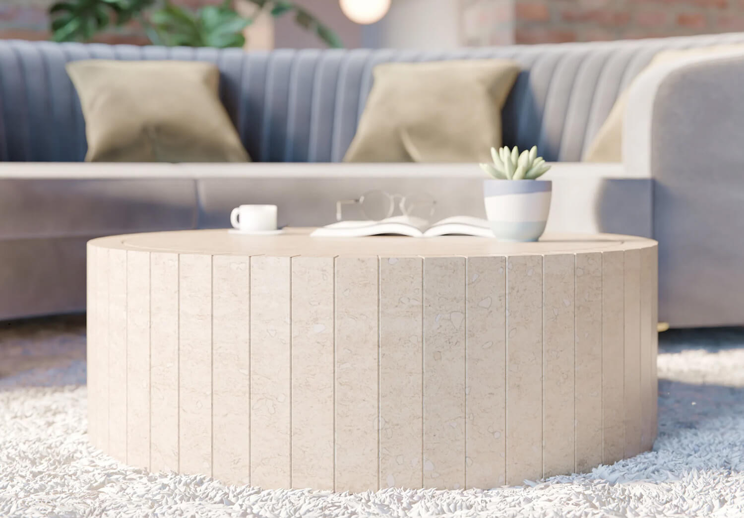
Material is one of the biggest UX challenges for interiors brands because screens flatten everything. A polished stone surface, a brushed metal handle, a linen weave and a painted timber finish can all look strangely similar if the photography is poor or the lighting is inconsistent.
A brand like Virrelli Stone, which sells handcrafted stone furniture, has to convey the weight and texture of natural stone entirely through photography and copy. The surface is part of the product’s value. The veining, thickness, edge detail, finish and natural variation all need to come through before someone sees the piece in person.
The same principle applies across the wider interiors market. Neptune has to present furniture, paint, fabrics and accessories as part of a coherent whole-home look. Loaf has a different challenge, because much of its brand appeal is built around comfort, softness and laid-back living. In both cases, the website has to make material qualities feel believable before the customer sees anything in person.
One common mistake is over-polishing the visual experience. Interiors brands can become so focused on perfect room sets that everything starts to feel slightly unreal. Customers still want the beautiful shot, but they also want the honest one: the close-up in natural light, the side view, the open drawer, the leg detail, the fabric texture, the view that feels closer to how the product will look at home.
For higher-value products, imperfections and variations should be treated carefully. Natural stone, timber, leather and hand-finished surfaces all have variation. Hiding that variation creates risk later, because the customer may receive something that does not match the overly perfect image in their head. Explaining natural variation clearly can make the product feel more premium, provided the photography supports the message.
Furniture websites often underestimate how anxious customers are about size. A product can be beautiful, well priced and perfectly styled, yet the customer still hesitates because they cannot tell whether it will work in their room.
Dimensions should be visible, plain and useful. Width, depth and height are the starting point, but furniture often needs more context than that. Seat height, tabletop thickness, clearance, weight, packaging dimensions and access requirements can all influence the decision. A customer buying a sideboard may care as much about the delivery route as the finish. A customer buying a sofa may need to know whether the arms come off, whether the delivery team will place it in the room and whether it can turn through a narrow hallway.
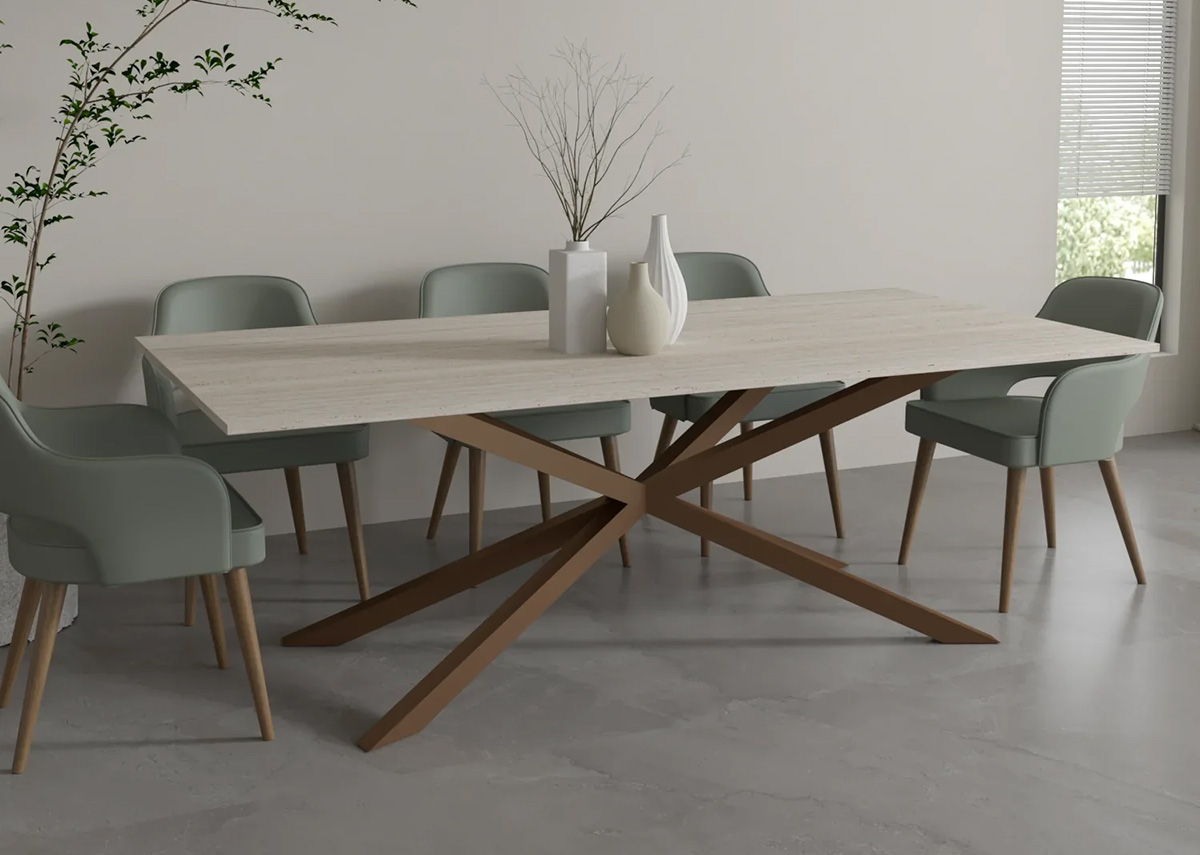
Room photography helps, although it can also mislead. A dining table photographed in a large open-plan kitchen may look modest online, then feel enormous in an average UK home. Where possible, brands should show products in different settings or provide simple guidance on space around the item. "Allow at least 75cm behind each dining chair" is the sort of practical detail that makes a site feel useful rather than decorative.
Video can do some of the work that static photography cannot. A short clip showing a cabinet opening, a sofa being sat on or a stone table being walked around can answer questions quickly. It does not need to be over-produced. For some products, a clear 20-second video is more reassuring than another beautifully styled still image.
Scale is where confidence is won or lost
Furniture websites often underestimate how anxious customers are about size. A product can be beautiful, well priced and perfectly styled, yet the customer still hesitates because they cannot tell whether it will work in their room.
Dimensions should be visible, plain and useful. Width, depth and height are the starting point, but furniture often needs more context than that. Seat height, tabletop thickness, clearance, weight, packaging dimensions and access requirements can all influence the decision. A customer buying a sideboard may care as much about the delivery route as the finish. A customer buying a sofa may need to know whether the arms come off, whether the delivery team will place it in the room and whether it can turn through a narrow hallway.
Room photography helps, although it can also mislead. A dining table photographed in a large open-plan kitchen may look modest online, then feel enormous in an average UK home. Where possible, brands should show products in different settings or provide simple guidance on space around the item. "Allow at least 75cm behind each dining chair" is the sort of practical detail that makes a site feel useful rather than decorative.
Video can do some of the work that static photography cannot. A short clip showing a cabinet opening, a sofa being sat on or a stone table being walked around can answer questions quickly. It does not need to be over-produced. For some products, a clear 20-second video is more reassuring than another beautifully styled still image.
The best furniture websites often feel editorial at first glance. They sell a way of living, a mood, a room, a taste level. That matters. People rarely buy interiors in a purely functional frame of mind. They are imagining a better version of their home.
The problem comes when the showroom experience gets in the way of shopping. A website can look expensive and still be frustrating. If pricing is hidden, product options are unclear, delivery information is vague or the path to purchase keeps disappearing, the customer starts to work too hard.
Furniture and interiors brands need ecommerce mechanics that feel calm and natural. Filters should match how people shop: size, colour, material, room, style, availability, lead time and price. Product cards should show enough information to help customers compare without clicking into every item. Swatches should be useful, consistent and named in a way people understand.
This is especially important for brands with deep ranges. If a customer is choosing between six dining chairs, twelve fabrics and three finishes, the interface has to make that choice feel manageable. Good UX reduces the mental load. Poor UX turns choice into admin.
There is a balance to strike with visual richness. Large imagery, atmospheric photography and editorial layouts help sell the dream, but they should not slow the site down or push key buying information too far down the page. Performance matters because furniture customers often browse heavily before buying. They may open several products, compare dimensions, return later, share links with a partner and revisit on mobile.
Many interiors brands sell in two ways at once. Some products can be bought directly online, while others need a conversation, a sample, a quotation, a showroom visit or a design consultation. This mixed journey is common in furniture, kitchens, fitted interiors, made-to-measure pieces and premium homeware.
The website should make those journeys feel intentional. A bespoke customer should not feel like they have failed because they cannot add something to basket. Equally, a ready-to-buy customer should not be forced into an enquiry form for a straightforward product.
Clear calls to action help. "Add to basket", "Order a sample", "Request a quote", "Ask about bespoke sizing" and "Book a showroom appointment" each suggest a different level of commitment. The language matters because it sets expectations. A customer making a £4,000 enquiry may need reassurance that they are starting a considered process, while someone ordering a £120 accessory may simply want a fast checkout.
Forms should be designed with care. Long enquiry forms can be useful, but only when the questions feel relevant. Asking for room dimensions, preferred material, timescale, budget range and postcode can help qualify an enquiry. Asking for too much too soon can put people off, especially when they are still exploring.
High-value home purchases carry risk. Customers worry about quality, delivery damage, returns, colour accuracy, lead times, aftercare and whether the company will be easy to deal with if something goes wrong. Trust has to appear across the whole website, rather than being left to a row of logos near the footer.
Delivery information should be specific. "Delivery calculated at checkout" is rarely enough for furniture. Customers need to know lead times, delivery areas, room-of-choice options, assembly options, packaging removal and what happens if access is difficult. If white-glove delivery is offered, explain it clearly. If certain products require special handling, say so before checkout.
Returns and guarantees should also be written plainly. Furniture brands often have different rules for made-to-order, bespoke and standard items, so clarity matters. Customers are more forgiving of restrictions when they understand them early. They become frustrated when important conditions appear late in the buying process.
Social proof needs to be relevant. Reviews are useful, but furniture buyers often want to see real homes, customer photos, case studies, press features, showroom information and evidence of craft. A strong About page can carry real commercial weight in this sector, especially for independent or premium brands. People want to know who is making the product, where it comes from and why it costs what it costs.
Furniture purchases often begin on mobile, even when the final decision happens later on desktop or after a showroom visit. Customers browse in the evening, save products, send links, compare colours and revisit pages multiple times. A poor mobile experience quietly damages all of that behaviour.
Mobile product pages need ruthless prioritisation. The first screen should make the product desirable, but the path to key details should be immediate. Price, options, dimensions, delivery estimate, swatches and calls to action should never feel hidden. Image galleries need to be easy to swipe, zoom and return from, because detail inspection is a major part of the decision.
Navigation also matters more than many teams expect. Furniture ranges can become complicated quickly: sofas, armchairs, footstools, dining tables, benches, beds, cabinets, lighting, mirrors, rugs and accessories. On mobile, the menu has to help people move by room, category and collection without feeling trapped in layers of navigation.
A good furniture or interiors website understands that buying for the home is emotional, practical and often slow. Customers need inspiration, but they also need proof. They need to imagine the product in their space, then check the details that make the decision feel safe.
The strongest sites tend to be those that respect both sides of that process. They present products beautifully, explain materials honestly, make scale easier to judge, support direct sales and enquiries, and remove friction from the practical parts of buying.
For furniture and interiors brands, design is doing real commercial work. It is helping customers believe that what they see on screen will feel just as good when it arrives in their home.
If you are planning a new interiors, furniture or ecommerce website, the right starting point is a clear understanding of how your customers choose, compare and buy. Somerset Design can help you plan and build a website that supports both the brand and the buying journey, from web design and ecommerce through to content, SEO and ongoing improvements.
© 2026 A&M Consulting Ltd t/a Somerset Design. Registered in England and Wales. Company No. 4377058 VAT Reg. 803 6289 32 Site Info