

It’s been almost two years since Google rolled out the revision to search results that weighted them according to whether the site was mobile friendly. Now it has announced plans to take this one step further by reporting that experiments have begun on a ‘mobile first index’ and the advisory that this could impact your site rankings if you’re not prepared.
Sounds like big changes are afoot, ones that could potentially see sites rise up or experience judgment day. Come with us if you want to live…
So first things first, what is this mobile first index and how will it affect our online experience both as site owners and users?
As anyone who’s walked through a town or city or looked around a cafe, bar or restaurant can tell you, mobile devices are everywhere apart from in people’s pockets. Google has confirmed that the majority of searches are done using mobile devices, however it currently ranks sites based on desktop content. So although sites may look the part on a tablet or phone, currently what matters is what’s available on the desktop version. This of course presents an issue when the majority of users visit a site for content that simply isn’t available to them.
From the Google announcement:
Today, most people are searching on Google using a mobile device. However, our ranking systems still typically look at the desktop version of a page’s content to evaluate its relevance to the user. This can cause issues when the mobile page has less content than the desktop page because our algorithms are not evaluating the actual page that is seen by a mobile searcher.
- Google, Webmaster Central Blog
With this announcement the need for responsive websites becomes more apparent. Initially Google’s preference was for sites that were optimised for appearance on mobile devices, meaning fonts were legible and images didn’t push outside of the boundaries and require scrolling. This preference was largely about accessibility. If your site looked OK on a smartphone then you were all good. This latest development takes that concept and goes a level deeper, requiring literally nothing to be lost in translation. Sites will be crawled as mobile sized versions of themselves and if the content doesn’t appear there then it isn’t showing up on the results page.
So will this have an impact on your site? Well that depends, according to the Google statement, the best way to be prepared is to have a fully responsive site:
If you have a responsive site or a dynamic serving site where the primary content and markup is equivalent across mobile and desktop, you shouldn’t have to change anything.
- Google, Webmaster Central Blog
Note the ‘primary content and markup is equivalent’ - content that is removed for a better fit on mobile will not be found by Google and will not be indexed. Interestingly Google has said that content that is hidden in accordions, tabs and other expandable content may have more of an impact on mobile but we’ll get to that shortly.
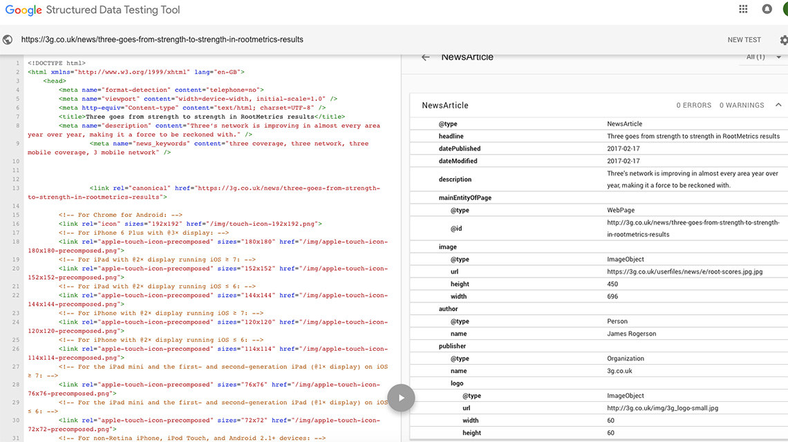
Here you can see an example of the Structured Data Testing Tool examining an article page on 3G.co.uk
For sites that offer different content and markup between the desktop and mobile versions, good use of structured markup can help. Use of the Structured Data Testing Tool is highly recommended, being sure to check both versions of the site. You should also verify your mobile version of the site with Google and use the robots.txt testing tool to check the mobile version is accessible to Googlebot.
One key change that will occur due to the mobile first index is the way Google treats content hidden in expandable elements. By this we mean anything in accordions, tabs, expandable boxes and down the back of the sofa; stuff that isn’t immediately obvious when you first arrive at a page but can be revealed with a click or tap. Google has always stated that content that is not immediately visible will be treated as having less impact than what’s being served up right in front of your eyes. However with mobile first indexing comes mobile UX, the part of the equation that allows for the functional user experience when browsing on a mobile or tablet. Because we want to keep all of the content from the full fat version of the site, but squeeze it onto a screen that’s maybe 375px or a third of the width, page content can get very long. As collapsing content into expandable elements helps the browsing experience by not giving the user RSI from scrolling, Google has said that content hidden for UX reasons will be given full weighting.
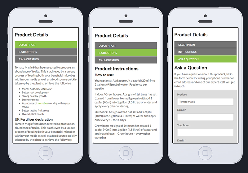
Expandable content in tabs on plant-magic.co.uk - a useful way of enhancing UX for mobile users
There are details still to be released of course and probably a few surprises to discover although Google say they are hoping for a ‘close to quality-neutral launch’ for the mobile first index, so the change should be minimally disruptive. But the message has gone out that the seismic shift from desktop to mobile will continue to send a few shockwaves, and the safest way forward is to have a site that responds to changes and doesn’t leave anything out.
© 2026 A&M Consulting Ltd t/a Somerset Design. Registered in England and Wales. Company No. 4377058 VAT Reg. 803 6289 32 Site Info