

When a user first arrives at your website, what is the first thing that they read? Where is their attention drawn to? It would be nice to think that every user will read every sentence and click on every call to action...
Well,They don't. Users don't read, they just scan a website following some common patterns, The Gutenberg, F Pattern and The Z Pattern. Today we will look at the those patterns and what they mean.
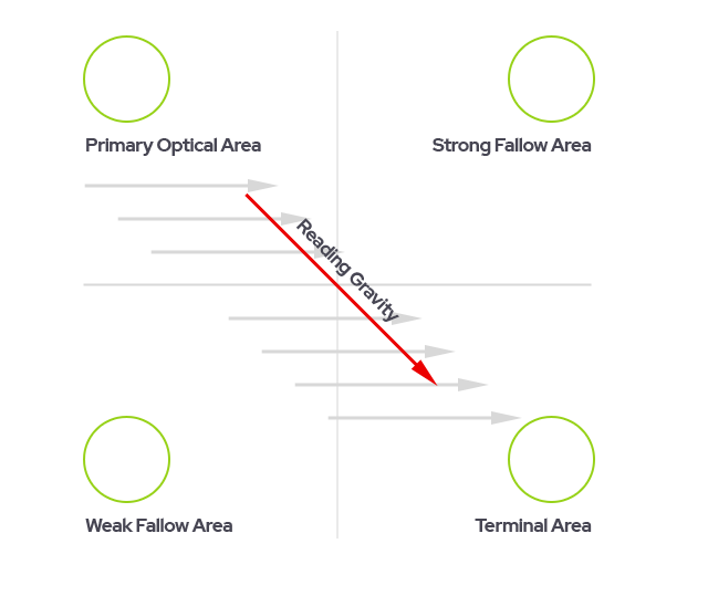
The Gutenberg diagram describes how cultures that read right to left visualise pages of evenly distributed content, a general pattern the eyes follow. The pattern applies to text-heavy content, such as pages in a novel or a newspaper. The pattern isn’t meant to cover every design possibility but is a general guide.
It also suggests that the eye will sweep across and down the page in a series of horizontal movements called axes of orientation. Each sweep starts a little further from the left edge and moves a little closer to the right edge. Important elements should be placed along the reading gravity path. I.e logo or headline in the top/left, an image or important content in the middle, and a CTA bottom right or Terminal area. This is said to improve reading rhythm for users...
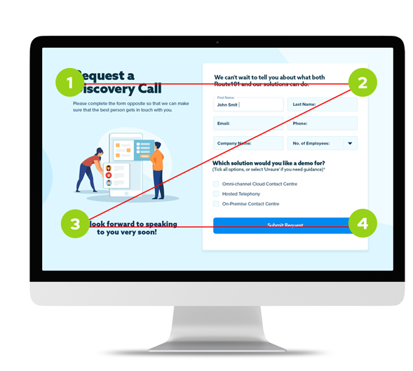
A landing page where the key purpose is the CTA at point 4. We want users to scan the page, take note of the CTA, and understand what the offer is.
As the name implies its a Z shaped pattern, sometimes referred to as a reverse S shape. The main difference is that we want viewers to pass through the two fallow areas 2 and 3 whilst also passing them through the middle and finally to point 4. We are creating a visual hierarchy, and thus influencing their journey. Z patterns are perfect for post click landing pages or pages with minimal copy, but they are not limited to that use.The main focus is on guiding a user to the terminal point 4 and converting via an interaction.
.jpg)
The z-pattern also creates what we refer to as The Golden Triangle. This is the formation of a right angled triangle with its 90 deg angle in the upper left corner. This creates the overall area first seen by users and thus is where we would tend to position our opening line and offering. It’s where we like to put the shouty bit...So try and use the area made by the triangle.
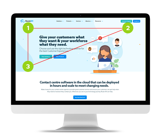
You can apply the Z pattern principal on lots of different page types, it just depends on what you want the user to do. Here you can see that the Z isn’t perfect, it doesn’t need to be. We are reinforcing a visual hierarchy with the key points.
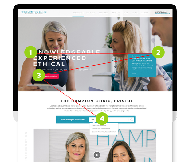
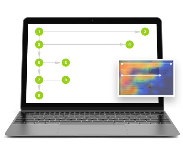
The Z-Pattern doesn’t have to apply to one section only. It can be a continuous flow down a page creating a “Zig-Zag” pattern. This is a more realistic pattern that users follow as we tend to scan pages on our initial visit. We start on the top left and move horizontally to the right. Then down to the left, and across and so on. So by positioning key elements on those pathways we can keep a user engaged and directed on the pathway we wish them to take.
F-Pattern Layout: The f-pattern was discovered by Jacob Nielsens’ company the Nielsen Norman Group in 2006 after studying users eye movements. It is often misinterpreted. It is a pattern that relates to how users “scan” web pages full of content. Users start to scan following the map on the right, and as they move down the page they tend to take less notice of content to the right. The move horizontally across to the left, then down, then across again until eventually scanning in a vertical motion down the left column. Users scan this way when there is little to no formatting, they are trying to be efficient in the use of their time, and they are not fully committed, which is in general how we use the web.
In some cases you simply cannot get away from the requirement to display large amounts of content. So try to do the following:
© 2026 A&M Consulting Ltd t/a Somerset Design. Registered in England and Wales. Company No. 4377058 VAT Reg. 803 6289 32 Site Info